Visualise Kafka
Some of my clients work with Kafka without ever developing an intuitive feel for its dynamics. Terms such as producers, consumers, partitions, offsets, lag, and consumer groups remain abstract until something breaks. To make these mechanics easier to understand, I built a small, intentionally playful simulation around a mission-control journey to the Moon. Kafka becomes the communication system coordinating the mission, while ASCII-based graphics show messages moving through the platform in real time. The humorous theme lowers the entry barrier, but the underlying goal is practical: to help people see how Kafka behaves, not merely memorize its terminology.
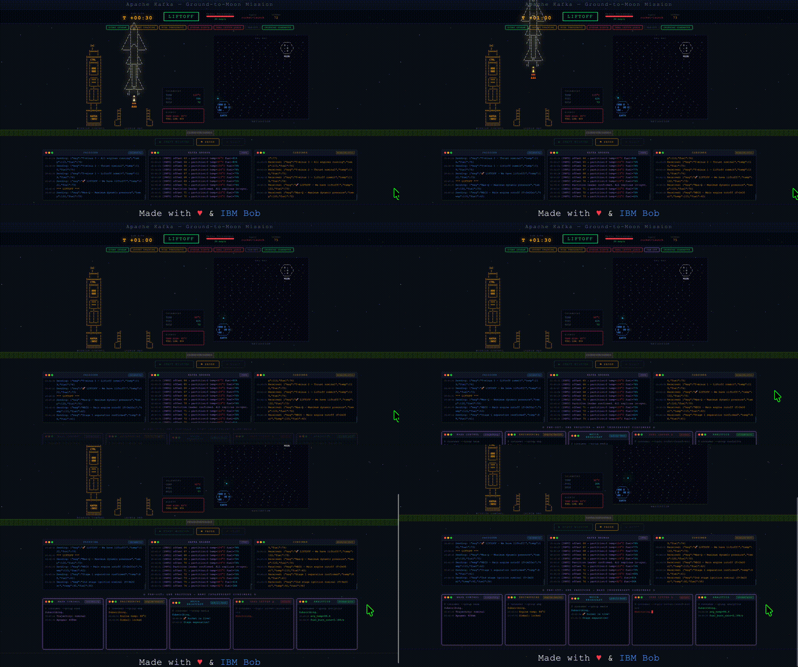
My quick demo to catch basics is deployed here.
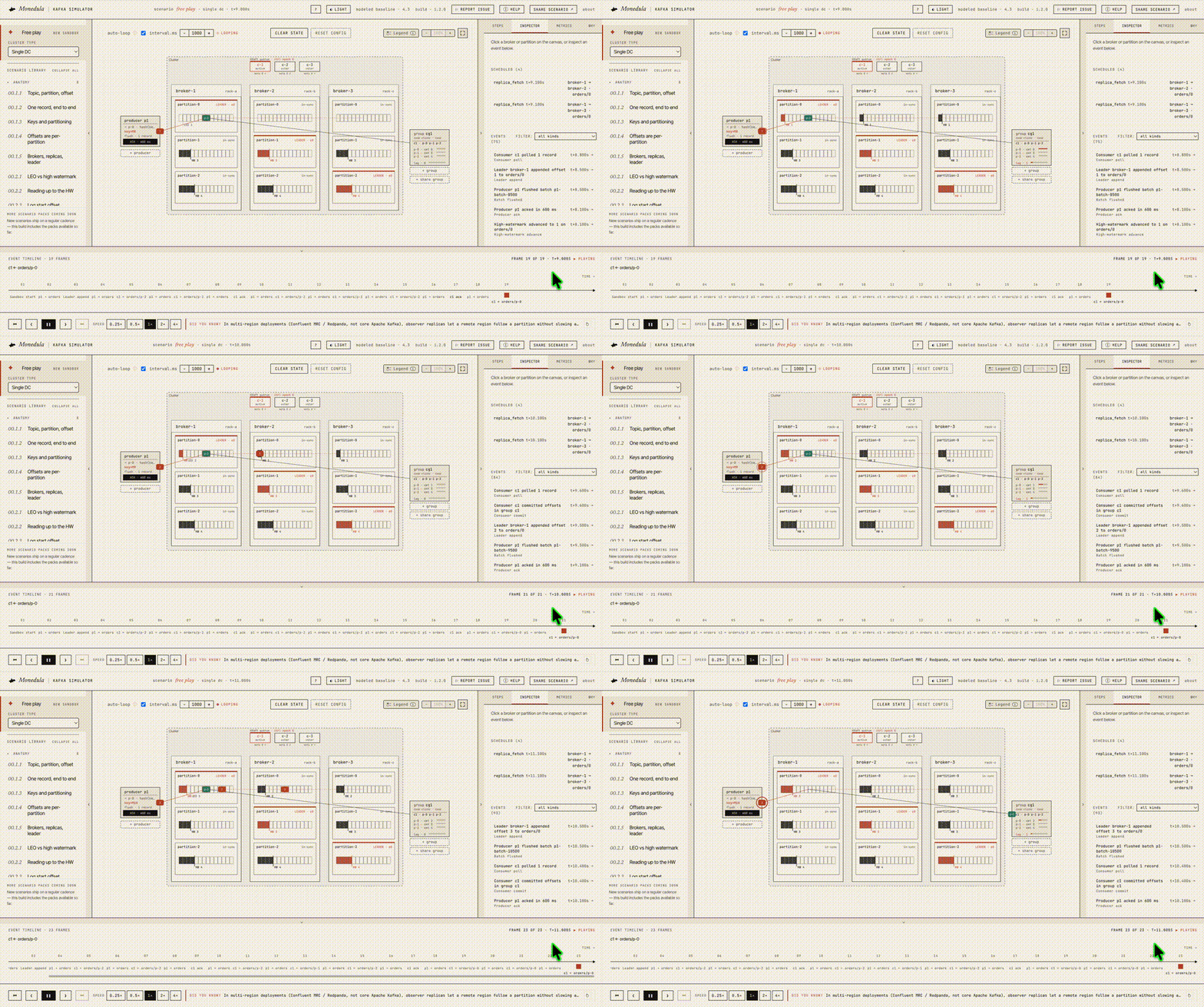
My friends from Softwaremill (one of the best Confluent/IBM BPs) created somethi much deeper - a very detailed technical visualization showing different scenarios of where and how Kafka can fail (right now about 25 scenarios and soon all 125 scenarios). A great foundation for deeper technical conversations with clients. Their demo is here.